THE LITTLE OVERLOOK-ABLE THINGS by Yarah David

I was helping a friend today with some very small elements of the redesign of her Scandi-chic bungalow (no that is not an oxymoron) - namely the doorhandles. It was an enjoyable few hours for me; basically consisting of using her internet and staying so long she was obliged to offer me lunch. During the course of this friendly abuse I was finally asked to use my years of design-savvy to seek out some, if it were possible, not totally objectionable door furniture (I LOVE that term - I always think of three piece suites no-more-nailsed to it). Simples right? How hard could it be? Really?

Hours later...I kid you not...hours! of near futile searching, I discover an obscure Pinterest pic with the very handle I had seen in my mind's eye. The ultimate item for the design and the taste of my highly exacting friend. It was near perfection. I showed her and we agreed. This was it! Jackpot! This lever handle for her soon much used kitchen door was worthy of its own brass plaque. A thing of real beauty and made from wood it was at the very least a sight for sore brushed-stainless steel weary eyes.

Yes you read that bit correctly. Wood. Don't scoff you haven't got one (have you?) it's divine.

The beauty that is HOLT. Designed by Alex Mowat for All Good.

The beauty that is HOLT. Designed by Alex Mowat for All Good.


But here is where Pinterest and I fall out. I'd found the pic that showed the perfect door handle but could I actually locate a stockist for it? (Pinterest pins often offer very little useful description or bother with detailed provenance). Or heaven forfend a price so we could ecstatically wave a credit card at it or sadly declare it OUT? Was there? No way. Uh uh. Not a chance. I still don't know what it costs and whether it was just a 'buy it now' button-push away.

My friend bravely went it alone and was made to settle for oxidised steel with a faux bark imprint which she declared an absolute hit. Now I love a bark imprint (child of the seventies) but as insensitive as I am I know when someone is bleeding inside. 

As I was. Left with the bitter taste of defeat and the memory of the perfect door handle I once saw online. SOMEWHERE.

But it got me thinking. This is big stuff. Minute but big if that makes sense. You may be tempted to pay scant attention to this key part of design ...the door furniture bit, and yet it's so important. It is after all the part of the door or drawer we can't help focussing on whenever we want to move either one in or out. Which in the course of a day or a lifetime is an awful lot. AND here's the thing that should have lifted a flag for me ages ago...I know I notice like mad suddenly when I walk into someone's house and there it is... a good one. A unique one, a pleasing one. Like mad. I'm a bit of a door handle/knob snob I realise. If that's a thing which I think it is.

So here's my blog post. A very small catalogue of door furniture that deserves a little squeak or even if its really great a shout out. You may not agree with me or ever be able to find any of them again, but at least like me you will know what to aim for. Seriously, enjoy!


SCANDI-CHIC. Another pared back wooden handle. Oak with an ebony line from Crowdy House.

SCANDI-CHIC. Another pared back wooden handle. Oak with an ebony line from Crowdy House.

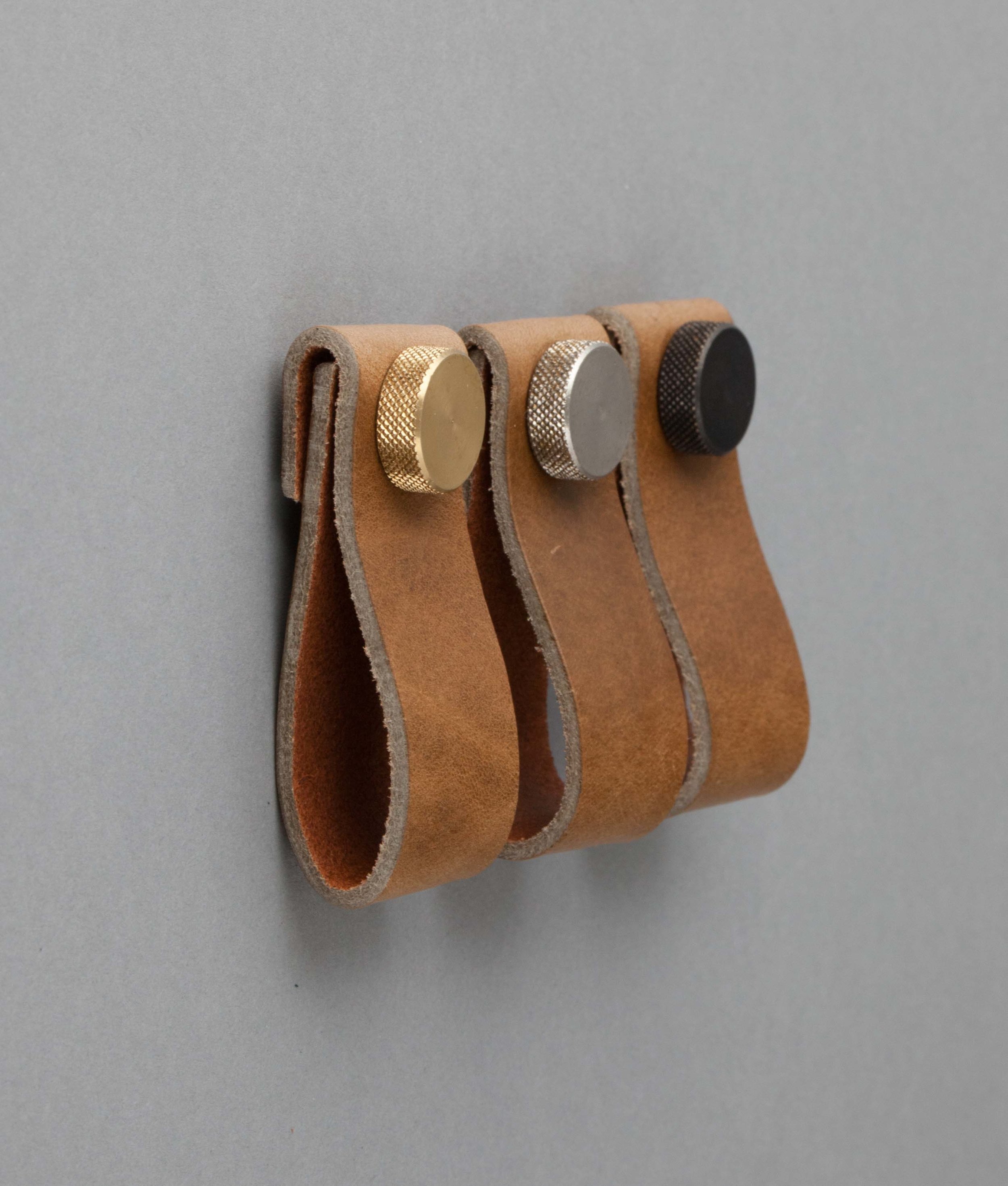
I was over the moon when this trend came in. PLEASING!! Leather pull handles, from Dowsing and Reynolds. A good place to look btw if you're in the market for hardware.

I was over the moon when this trend came in. PLEASING!! Leather pull handles, from Dowsing and Reynolds. A good place to look btw if you're in the market for hardware.

This handle screams class. Plain Brass bar by Cult Craft.

This handle screams class. Plain Brass bar by Cult Craft.

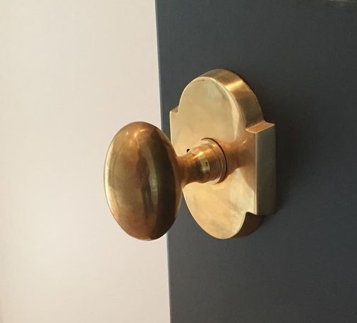
Sometimesd you just cant go wrong with vintage. This one has a particularly interesting plate. Unvarnished brass doorknob from Brandino Brass. feels so good in the hand.

Sometimesd you just cant go wrong with vintage. This one has a particularly interesting plate. Unvarnished brass doorknob from Brandino Brass. feels so good in the hand.

The Victorians liked things embellished. Sometimes I do too when dealing with period properties. Brass flower design. When only Old school will do.

The Victorians liked things embellished. Sometimes I do too when dealing with period properties. Brass flower design. When only Old school will do.

Ahh how I love you...Bark brass cabinet pull handle.

Ahh how I love you...Bark brass cabinet pull handle.

Elmes architectural door handles, just beautiful.

Elmes architectural door handles, just beautiful.

Texture is the thing. A smorgasbord of pressed snake, lace and crocodile skin. 

Texture is the thing. A smorgasbord of pressed snake, lace and crocodile skin. 

On the right piece these simple warm metal (copper) cup handles WORK! 

On the right piece these simple warm metal (copper) cup handles WORK! 

I could basically go on and on...so many styles and ideas out there, I've seen twigs drilled through and bolts inserted, sea shells, stuffed barbie heads? I kid you not.


Look at this for an over zealous door handle.. A weird crawling man - don't ask from where, I really I don't know (Pinterest strikes again). It's crazily ambitious as a door pull and someone clearly spent a lot of time and money conceiving…

Look at this for an over zealous door handle.. A weird crawling man - don't ask from where, I really I don't know (Pinterest strikes again). It's crazily ambitious as a door pull and someone clearly spent a lot of time and money conceiving it. Whether that was advisable I will leave to the beholder. 

But the point still stands, this stuff is important. It's perhaps one of the last things we come to consider in a room scheme and the first thing the client actually uses! (Go figure the logic in that from the success of a design point of view.) I'm genuinely considering STARTING from the handles on the next project. As a designer we really are asked to consider everything. With a little more thought this aspect could get very interesting.

DRAWING FROM THE SILVER SCREEN by Yarah David

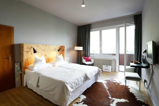
So when I was asked recently to help breathe new life and Millenial coherency into the interior of a slightly fading hotel in the Austrian Alps I wasn't sure where to start. It's a huge project, so there was a certain amount of headless chickening, but then I remembered where this always starts whatever the size of the project. It starts with the client, of course, and with the building itself.

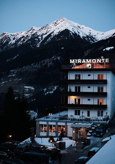
Hotel Miramonte in Bad Gastein is a Goliath of a building, a concrete behemoth occupying an commanding spot at the foot of the Graukogel mountain looking across a deep gorge to the tumultuous waterfall that runs through the centre of this once very famous alpine resort. The hotel is beautiful in many ways and a huge block of concrete in others, like an ocean liner run aground. Built in 1930s it feels quite experimental for the age and more reminiscent of Brutalist architecture 30 years later. But it certainly has bags of style and this is where I finally, with the help of Ike Ikrath, the owner, drew inspiration from the movies and specifically Bond, James Bond. The early one. The one who had assignations on satin covered sheets and didn't talk about real feelings, ever. The Bond who tore through sets designed by the genius Sir Kenneth Adam. Miramonte has that air of intrigue and glamour, the alpine retreat you might imagine owned by a baddy whose cavernous HQ is built into the rock of the basement. Ike and I looked at stills from Goldfinger and The Avengers (another of Ike's favourites) and pieced together the elements that would create the look we wanted. I kept the alpine goat skin rugs and fluffy bathroom robes (Bond was often in a hotel robe I recall) and wove in the other elements.

 Sadly the project is not complete yet, so I don't have any 'after' photos but I thought it would be fun to have a look at the way the design I finally came up with evolved.

The Miami hotel in Goldfinger. I love the silk couched wall - I have appropriated this look for oversize bed headboards.

The Miami hotel in Goldfinger. I love the silk couched wall - I have appropriated this look for oversize bed headboards.

Goldfinger again. We will use the design of the inset shelf; a strong graphic for housing paperback books, (Ike has a huge collection he puts in the rooms).  Copper plating like that on the door will be used to clad the shower and freestanding …

Goldfinger again. We will use the design of the inset shelf; a strong graphic for housing paperback books, (Ike has a huge collection he puts in the rooms).  Copper plating like that on the door will be used to clad the shower and freestanding baths.

Avengers - The three lights above his head will be used to light the Bath alcoves in the rooms.

Avengers - The three lights above his head will be used to light the Bath alcoves in the rooms.

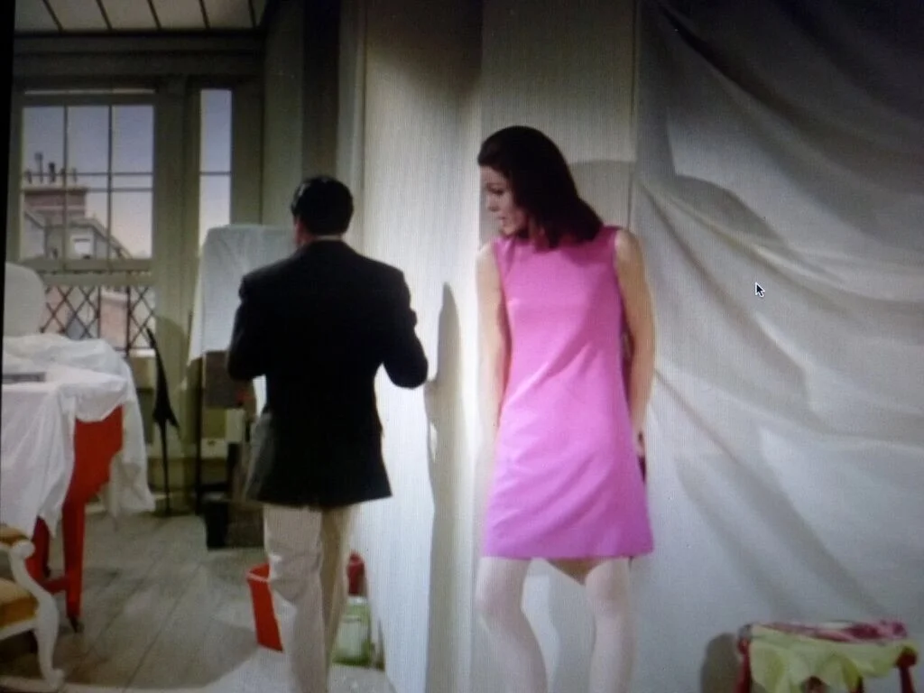
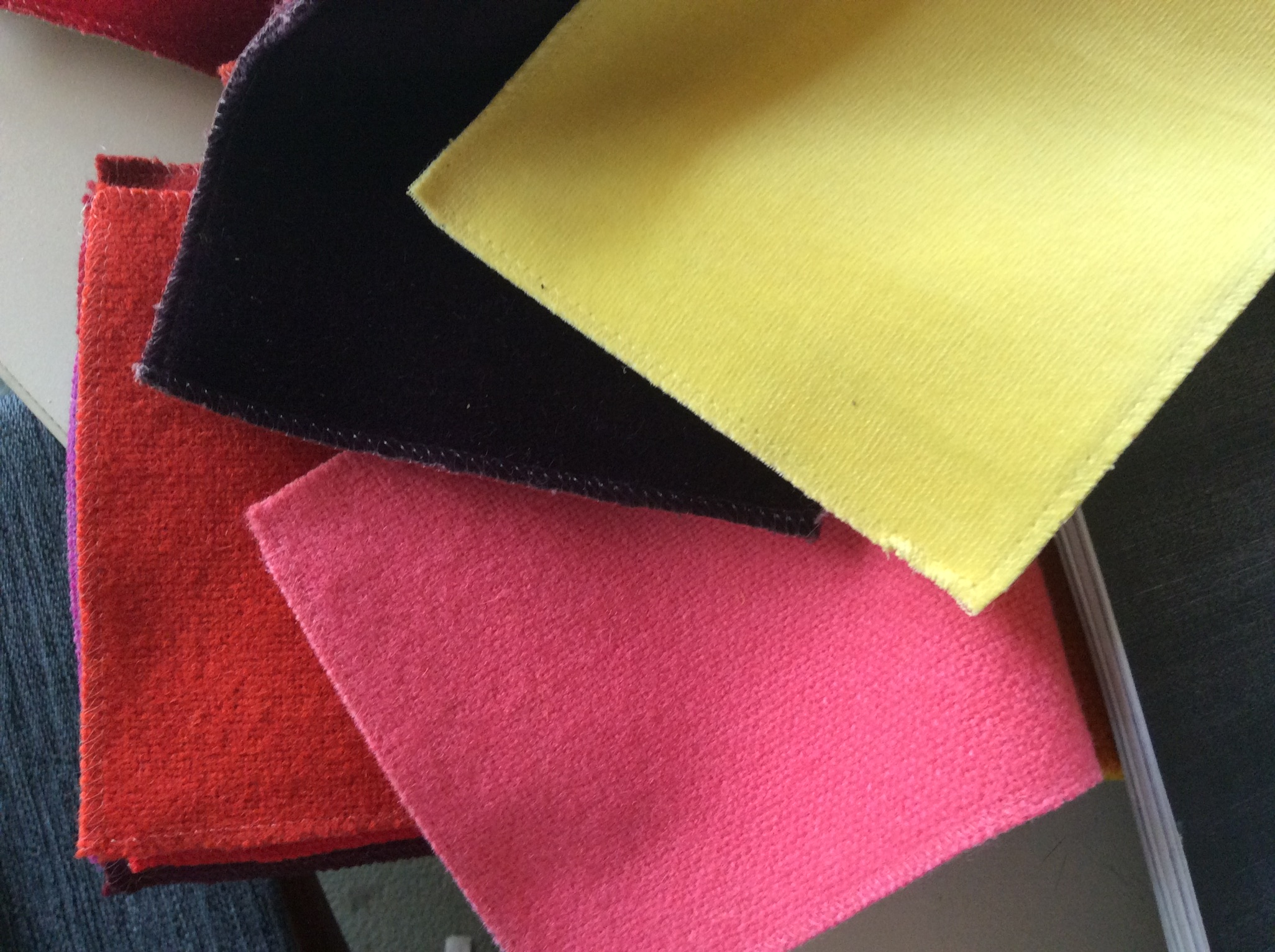
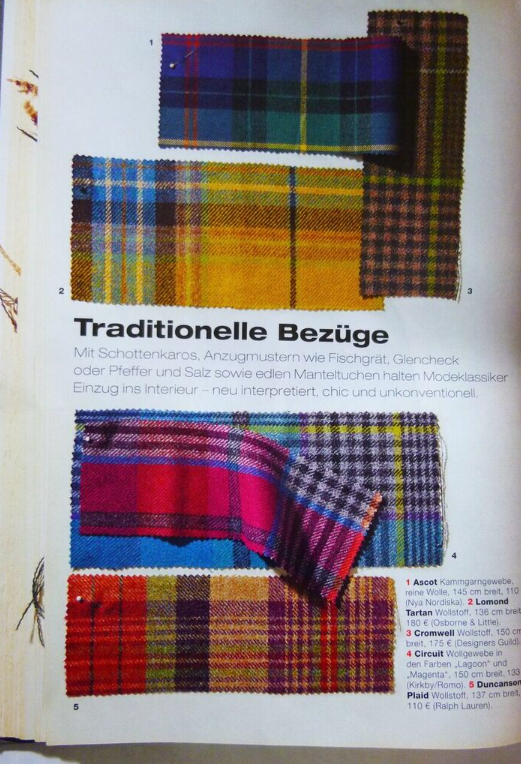
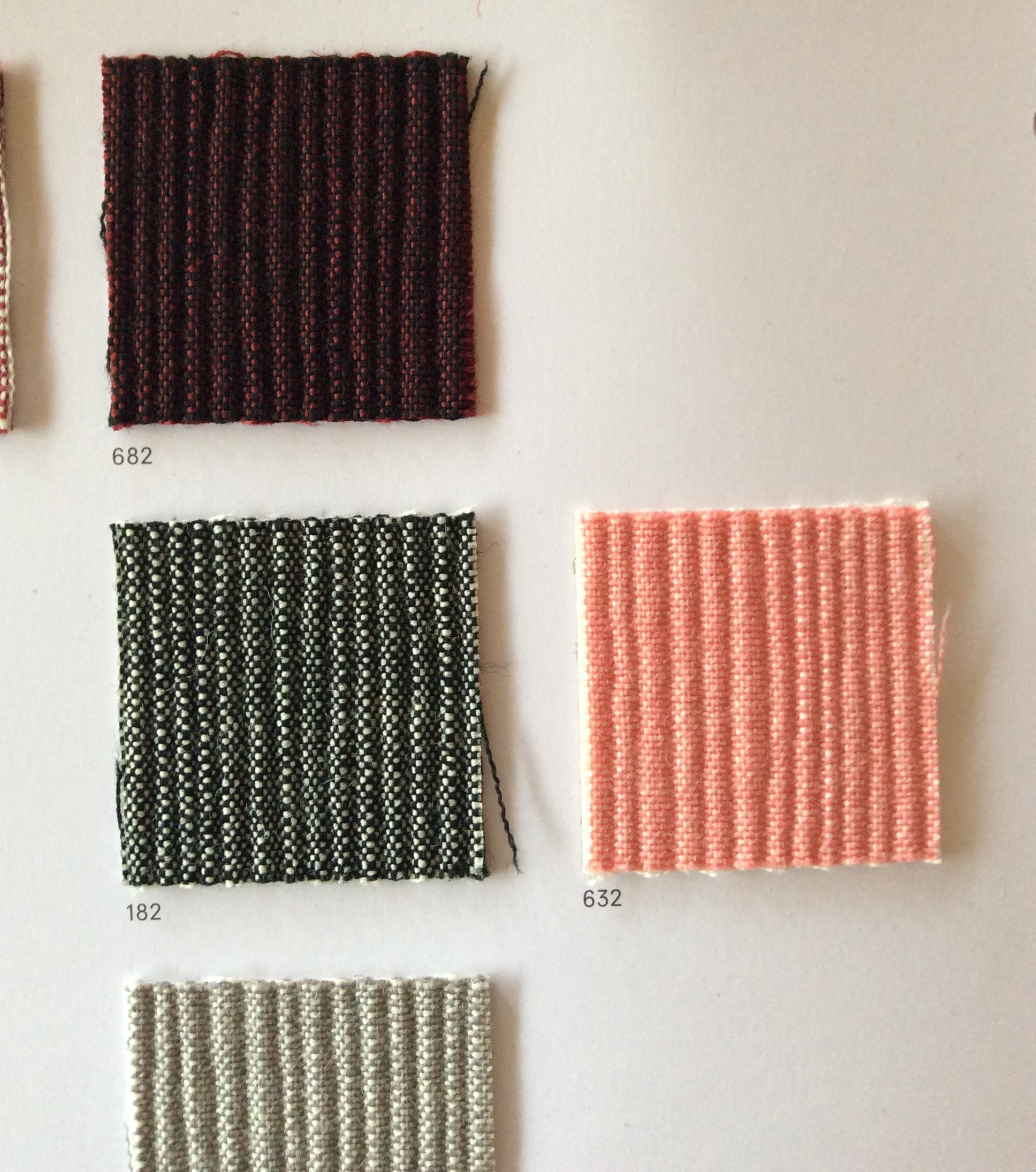
I drew on the strong colours in Emma Peels' wardrobe for the fabric choices of the upholstered elements in the rooms, lemon yellow, bubblegum pink, deep night blue.

These new Puzzle tiles by Edward Barber and Jay Osgerby for Mutina will to work perfectly with the late 60s look.

These new Puzzle tiles by Edward Barber and Jay Osgerby for Mutina will to work perfectly with the late 60s look.

Peignoir by Farrow & Ball. The grown up grey pink will work in summer or winter, so perfect for an alpine hotel that operates in all seasons, and be a great ground for the brighter colours.

Peignoir by Farrow & Ball. The grown up grey pink will work in summer or winter, so perfect for an alpine hotel that operates in all seasons, and be a great ground for the brighter colours.

As modern as this seems when combined with the paint colour above, this laid back but luxurious layered bed linen in pinks and greys will work perfectly.

As modern as this seems when combined with the paint colour above, this laid back but luxurious layered bed linen in pinks and greys will work perfectly.

No alpine hotel would not be complete without this at the foot of the bed - goat hair ottoman.

No alpine hotel would not be complete without this at the foot of the bed - goat hair ottoman.

Hotel Miramonte currently.

BRINGING BACK THE BOLD by Yarah David

I don't know what it is. We are in desperate times certainly as countries sheer off from one another with an ear wrenching crack over the Brexit fiasco, but there is in interiors a perceptible reaction brewing against the stark and muted tones of the 50 Shades Greyer years we've all had to endure, and in its place a general warming and brightening. I've seen it.

It started with bringing the outdoors in, swathes of acid green and glossy emerald green foliage in rose gold terrariums. And grew louder with a desperate sort of excitement as Farrow & Ball announced the launch of the 9 new paint colours, the first in...simply ever, but yes, colour is BACK. With a big old fashioned bang. Right between the eyes people. Hurray!!!

OK so let me break this down....colour IS back but (caution required) not with the sort of pop that would have you doing over the drawing room in neon pink, no this trend is in the reassuringly grounded tones of Peignoir (a divine pink grey - yup not gone yet) Mustard, Terracotta (a good version) and Malachite green. Colour is back kids, but it's definitely grown up a lot. So  indulge by all means but infinite care is required, not any old colour will do.

Sit back and observe.

Salon-Drab, Yeabridge-Green and Plummett. F & B

Salon-Drab, Yeabridge-Green and Plummett. F & B

Inchyra Blue F&B  @mrgeorgeclarke's

Inchyra Blue F&B  @mrgeorgeclarke's

Green Smoke F & B

Green Smoke F & B

Bathroom in Stone Blue and Rectory Red. F & B

Bathroom in Stone Blue and Rectory Red. F & B

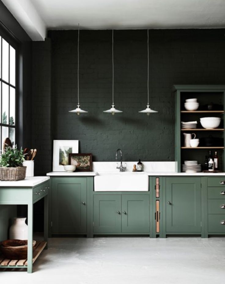
De Vol malachite green kitchen Peckham Rye

De Vol malachite green kitchen Peckham Rye

44d86fefae59c36fea3a55cb924dab37--dark-green-kitchens-kitchen-dark.jpg
Almost my perfect combination

Almost my perfect combination

Wow! This is colour blocking on a whole new scale.  

Wow! This is colour blocking on a whole new scale.  

Bliss.

Bliss.

Olive green plays sky blue beautifully.

Olive green plays sky blue beautifully.

Even clashing tones of peach and terracotta will work - Proceed with caution.

Even clashing tones of peach and terracotta will work - Proceed with caution.

RUSTIC STYLE: GOING, GOING ...GONE by Yarah David

You'd be forgiven for thinking there genuinely was a period when "If it doesn't move... clad it!" was the sole cry on building sites from Fife to Falmouth. It seemed that way right? And this of interior walls mind. In the past few years wood (or wallpaper printed to look like strips of wood) on the walls of brick built domiciles was just about everywhere because (and whisper this incase it gets out)... Interior cladding is big news. Big. Huge!

At least it was

And that's my point. Just when you thought every house was in danger of ending up resembling the Davy Crockett's cabin I think we may have seen the last of it. In the fair isles of the UK at least. For now. It's had a good run and for that many an unscrupulous gash wood merchant has been grateful (and gone chuckling off to the airport with bags packed on the proceeds) but interior fashion has finally moved on. Or rather just taken a well earned rest in the safe harbour of Scandi chic design. (White, concrete, shearling and warm metals any one?)

...Again.

Which is why I thought I'd write this post. As a homage if you like. To say goodbye. For now. To my old friend of instant character (I have been guilty, I confess, of harbouring a pallet or 2 of painted Victorian floorboards with a serious intent to clad, it's true)

A visual ode to all that cladding - we loved you well.  

Elle Decoration - Lights by Toscarini

Elle Decoration - Lights by Toscarini

Horizontal cladding - Shoreditch House, London

Horizontal cladding - Shoreditch House, London

Rustic style kitchen with apple box drawers.

Rustic style kitchen with apple box drawers.

Kitchen Units made from salvaged T & G panelling. London.

Kitchen Units made from salvaged T & G panelling. London.

Repurposed Victorian floor boards, Somerset.

Repurposed Victorian floor boards, Somerset.

Slowpoke Espresso Bar Cafe from recycled materials by Anne-Sophie Poirier

Slowpoke Espresso Bar Cafe from recycled materials by Anne-Sophie Poirier

Ski Out/In Ski Lodge Montana

Ski Out/In Ski Lodge Montana

Rustic cabin bedroom, Rockies.

Rustic cabin bedroom, Rockies.

DECOR BY WAY OF MARRAKECH by Yarah David

Ah Morrocco. The Moors. And a legacy of design that is so exotic and decorative it is simply, well, Moreish. The country is extremely diverse, with residents that are Arab, Berber, European and sub-Saharan African whose collective cultural hertitages contribute to a design style that is rich and varied. Even so, as diverse as the influences are, Morrocan style can generally be characterised by a few well known decoratif motifs, (such as the horseshoe arched doorway) and with the addition of only a few key features; think super rich jewel colours, fretwork screens, intricately carved woodwork and multi patterned tiles, any home can take on an the air of a Morroccan riad. It probably goes without saying I'm a huge fan, hence a well deserved post on Decor by way of Marrakech; the enduring influence of Morrocan design. 

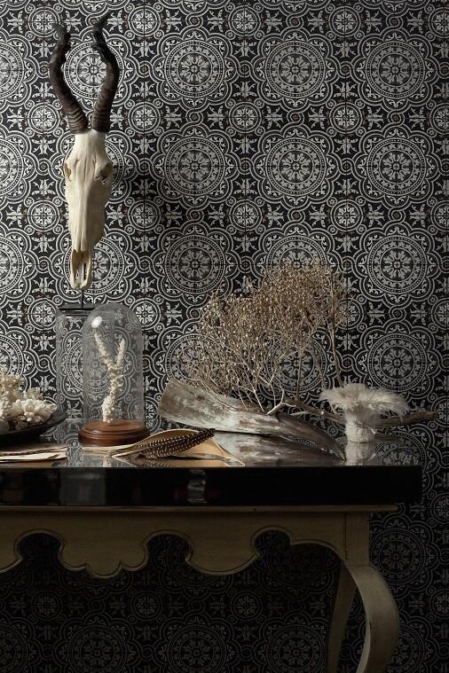
There is nothing shy or retiring about these monochrome Morrocan style tiles. And choosing to decorate with Morroccan tiles is often about making a statement, so why not? If you're going to do it, be bold.

There is nothing shy or retiring about these monochrome Morrocan style tiles. And choosing to decorate with Morroccan tiles is often about making a statement, so why not? If you're going to do it, be bold.

Alternatively here's how to do pared down classic Morrocan styling, Arabian arches with green and white trellis wall tiles - Turkish themed Spa at Glenmere Mansion, upstate New York. 

Alternatively here's how to do pared down classic Morrocan styling, Arabian arches with green and white trellis wall tiles - Turkish themed Spa at Glenmere Mansion, upstate New York. 

Another screen influence - minimal graphic take on a well known quatrefoil trellis shape. 

Another screen influence - minimal graphic take on a well known quatrefoil trellis shape. 

Decorative horseshoe arch and classic tiles in sea green make for beautiful serenity in this bath alcove.

Decorative horseshoe arch and classic tiles in sea green make for beautiful serenity in this bath alcove.

Fresh morrocan tiles make a sharp citrus splash in the kitchen.

Fresh morrocan tiles make a sharp citrus splash in the kitchen.

Classic blue and white hand painted tiles compliment old brass bathroom fixtures beautifully.

Classic blue and white hand painted tiles compliment old brass bathroom fixtures beautifully.

Contrasting rose concrete encaustic tiles make a feature of this shelf nook.

Contrasting rose concrete encaustic tiles make a feature of this shelf nook.

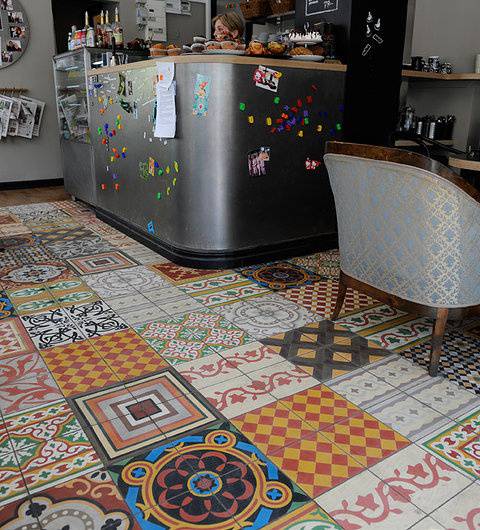
Randomly laid squares of patterned tiles make up a vibrant patchwork floor.

Randomly laid squares of patterned tiles make up a vibrant patchwork floor.

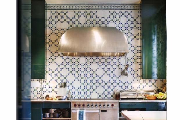
Emerald green cabinets and a wall of tiles - cleverly broken up with blank white tiles to alleviate and refresh the look of the repetitive pattern.

Emerald green cabinets and a wall of tiles - cleverly broken up with blank white tiles to alleviate and refresh the look of the repetitive pattern.

Fretwork screen archway, cool aqua-wash walls and a decorative fan mirror. A Morroccan edge cleverly combined with European influences. 

Fretwork screen archway, cool aqua-wash walls and a decorative fan mirror. A Morroccan edge cleverly combined with European influences. 

Maximum impact; wall to wall geometric tiles in the walk in shower. Contrasted by plain stone tiles on the floor and seat.

Maximum impact; wall to wall geometric tiles in the walk in shower. Contrasted by plain stone tiles on the floor and seat.

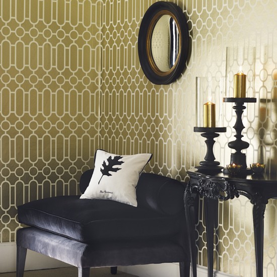
Simple geommetric trellis pattern bought up to date in chic gold and white.

Simple geommetric trellis pattern bought up to date in chic gold and white.

AAH... uPVC HOW I HATED YOU by Yarah David

So, uPVC windows (and doors)..shall we discuss? Do we have to? Yes, let's. The rise and rise of the uPVC replacement is, in my opinion, one of the untold design trajedies of the modern era (worse even than postwar housing) and nowhere is worse hit than the United Kingdom. We are not a large country, we are a pretty, small, island and we have a surprising amount of quite lovely, some might say idyllic, houses dotted about hither and yon looking all quaint and historic. Or at least we did. Since the invention of the plastic replacement window this wipe clean, paint free, charm free horror has become the scourge of the beautiful landscape we live in and marrs almost every half decent (and even some not so decent) building in the country. You literally cannot go a hundred yards in any direction (except in the smartest postal codes) without coming up short against them. Like bandaids on a pretty face. 

A standard uPVC replacement window style.

A standard uPVC replacement window style.

So just briefly let me count the ways I hate them...Firstly there's the ridiculous and offensively bright white colour, (nothing historic or Anouska Hempel about it), secondly there's the smell, (straight out of a chemistry lab), thirdly the unnatural creaking as you open them and the horrid plastic frame rubs against the horrid plastic sill, fourthly the stubby thick sightlines leaving barely enough room to see out, fifthly the nasty faded nicotine yellowing they get when they're old, sixthly the cracking (sanding and repainting not an option)...Shall I go on? I could...oops maybe not, too many. But in short it may be said that I was a staunch, if not zealous, critic of the uPVC replacement window. Yes, yes, I know they are essentially maintenance free - apart from the odd wipe down with a soapy dishcloth, and certainly they are a fraction of the price of wood or steel (about a quarter) but still, really? Do we have to? They are killing the beauty of the roadside hamlet, the pretty tucked away village and even the large urban sprawl...pretty much stone dead. 

At least that was my opinion, dearly held - and even argued with a weird haughty vehemence, until I visited The National Self Build Centre in Swindon (well worth a look by the way, even if you are not lucky enough to be planning a self build). I was there to research aluminium doors for a client (more on their highs and lows in another post later) studiously ignoring the plastic windows, when I found myself in the uncomfortable position of being wrong.

Cold flat out wrong.

Because as I wandered about my eye was caught by some Georgian style, small paned double glazed windows with slight little glazing bars that I took to be wood. I hurried over just to get a feel of the illustrious product, only to discover to my wonderment that the windows were made of plastic. Ridged and lined to look like wood, and coloured in a pleasing Farrow & Ball type verdigris. But honest to goodness, right out of a factory plastic. And they looked good. Really good. From a few paces away you would be fooled. As I was. I picked up the literature.

Residence9 is a new window system designed to replicate the 19th Century Flush Sash Window System. 

res9 cream
res9 handle

I went around behind them and opened them out. Not wood, but the action was clean and smooth. No smell. The interiors were beautifully moulded, no creaking or squeaking. The handles were smooth, heavy and well designed. And just incase you were wondering R9 windows have U-value of just 0.8 W/m2K, meaning they are one of the most energy efficient windows on the market. After that there was no stopping me, I was Impressed from Somerset. I tore around greedily taking in this new plastic window revolution. There were many different types and some still looked like the old smooth planed, bright white nightmares, but most did not and some even were lined with real wood inside (try Blackmillwork.co.uk) so that from the interior, you couldn't tell. Did you hear me? You couldn't tell. Outside the wind would howl and the rain pour down and your wipe clean, Evergreen (or Dove grey or Duck-egg blue or whatever colour you chose to compliment your lovely 16th Century house - probably Stone) would be safe as could be withstanding the storm and you'd be by the fire gazing out of your wood framed sash windows happy in the knowledge that you weren't going to be dragged aside at a village meeting to be upbraided for ruining the chance of winning the Most Beautiful Village award for the third year running. 

Now I am not going to lie. This type of artful deception does not come cheap, (approximately £350 per m2 of glazing, compared to standard white Everest type uPVC of £200m2 ) but the fact is one day it may and while the plastic torment rolls on and people persist in wanting to put their windows in and forget about them, there is now a greater hope that as I drive the highways and byways blithely minding my own business (if only!) I will no longer be struck dumb (again, if only!) with the horror of all that lost beauty. 

VINTAGE INDUSTRIAL UPCYCLING by Yarah David

Vintage Industrial styling is a huge design story right now. Think New York loft with exposed ducting, concrete walls and the kind of oversized caged metal lights last seen in a Polish factory. To feed this recent addiction any number of smart design studios are buying up original bits of furniture and upcycling them to create new usable fittings. They look fantastic, but have price tags to match. This wooden sink sideboard is from Italian design company, Manoteca.com and costs £1500.

£1500

Like it, but too expensive? You can, with a bit of effort, find the very same yourself, for a fraction of the price. 

This old carpenters bench was recently posted on Ebay for £200 and eventually sold, complete with original iron vice for £108.

It wouldnt have taken a huge amount of effort to source a similar inset ceramic sink. ( Caple £299)

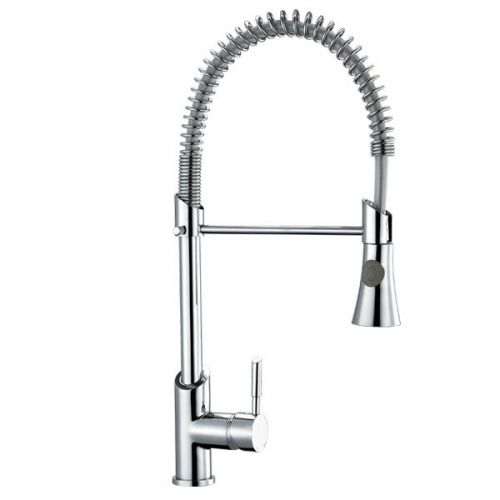
And tap. (Milano chrome pull down £49)


After a light sand (being careful to retain the original patina of the paint stains) and the application of a good oil such as OSMO, voila: one Artisan Carpenters Sink Unit.

Lost for where to start? Try bric a brac shops, second hand/ charity stores, yard sales, large car boots, reclamation yards, Preloved, Gumtree and of course Ebay. There are no end of gems cluttering up attics and garages across the country whose owners would probably pay to have it cleared. Go rummage. And create.

INTO THE WOODS by Yarah David

My daughter is three, and we are moving house. Cue huge excitement! Well from me at least, not her. "I love our house mummy, I don't want to leave." (sob). So, for the moment at least, the huge excitement is mine, but not for the vast and daunting task of packing... no for the joyful delight of decorating all a-new. Nothing a woman likes more than to nest. Nothing a designer likes more than to plan for nesting. And this week I'm dreaming of ways to feather that nest so snugly, so soundly and so softly that my daughter will never think of the past. Not once. Not ever. My plan? To design her the best Goodness to Heaven bedroom a girl ever owned, well nearly. So where do I start?
Walls.

and Animals. Or rather walls with animals. Scroll on for my current fave animal themed wall embellishments.

Kelda wallpaper, by Scion. What is not to love? The woodblock style is folksy and childlike all at once and is busy without being ovrebearing giving your little one lots to look at: prancing deer, snuffling hedgehogs and hopping hares. Woodland…

Kelda wallpaper, by Scion. What is not to love? The woodblock style is folksy and childlike all at once and is busy without being ovrebearing giving your little one lots to look at: prancing deer, snuffling hedgehogs and hopping hares. Woodland on a roll!

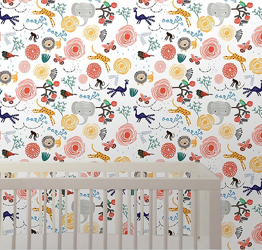
Jungle, by Wallpaper Arts, colourful and sugary sweet, though possibly aimed at newborn-toddler age range.

Jungle, by Wallpaper Arts, colourful and sugary sweet, though possibly aimed at newborn-toddler age range.

Beautifully illustrated bear, deer, owl, fox. Completely delightful but if I'm honest a tiny bit confrontational for a three year old!

Beautifully illustrated bear, deer, owl, fox. Completely delightful but if I'm honest a tiny bit confrontational for a three year old!

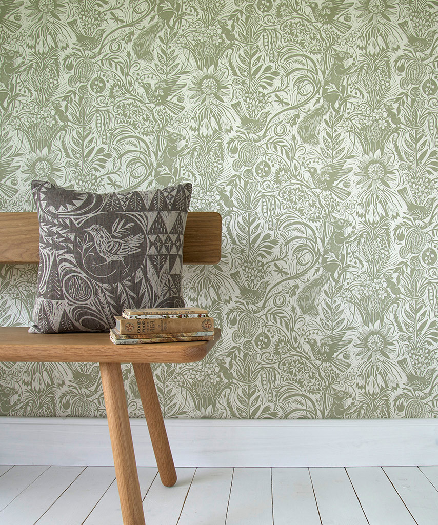
Squirrel and Sunflower by Mark Herald is another intricate linocut inspired design. Hours of happy gazing right here.

Squirrel and Sunflower by Mark Herald is another intricate linocut inspired design. Hours of happy gazing right here.

Dragon by Nubie Modern Kids. Simple but magical design. In pink it could be a winner.

Dragon by Nubie Modern Kids. Simple but magical design. In pink it could be a winner.

British Isles Owls, Abigail Edwards...Again with the eyes!

British Isles Owls, Abigail Edwards...Again with the eyes!

A classic. Squirrel and Dove design by Sanderson

A classic. Squirrel and Dove design by Sanderson

Woodland Creatures wallpaper - provenance unknown. My daughter would love this, but sadly it is vintage and unobtainable, but so delightful I couldn't leave it out! Kind of knocks spots off everything else.

Woodland Creatures wallpaper - provenance unknown. My daughter would love this, but sadly it is vintage and unobtainable, but so delightful I couldn't leave it out! Kind of knocks spots off everything else.

Wall art - felt animal heads! If you're looking for an all out menagerie...and somewhere to hang a hat, could do worse.

Wall art - felt animal heads! If you're looking for an all out menagerie...and somewhere to hang a hat, could do worse.

Oak Tree wall mural by Isak.com. Scandinavians seem to do this sort of silouette book illustration best.

Oak Tree wall mural by Isak.com. Scandinavians seem to do this sort of silouette book illustration best.

Animal head vases. (Graham & Green) Yes! So cute. Lovely way to bring flowers into a child's bedroom without the worry of the vase being knocked over with rumbunctious play. And they're stunning.

Animal head vases. (Graham & Green) Yes! So cute. Lovely way to bring flowers into a child's bedroom without the worry of the vase being knocked over with rumbunctious play. And they're stunning.

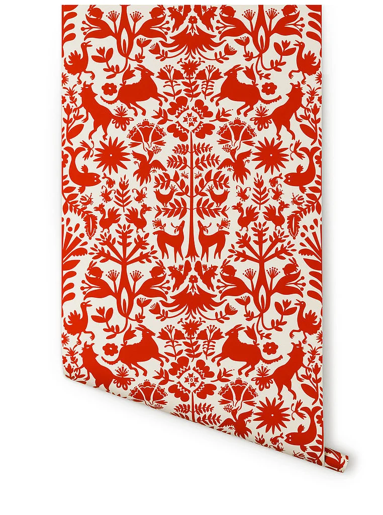
Otomi wallpaper, by Emily Isabella. Gorgeous Folk Art style but overpoweringly red. Accent wall or interior of a cupboard could be perfect.

Otomi wallpaper, by Emily Isabella. Gorgeous Folk Art style but overpoweringly red. Accent wall or interior of a cupboard could be perfect.

The Wild, by Minakani Walls. Just Stunning. (Like the rug too!).

The Wild, by Minakani Walls. Just Stunning. (Like the rug too!).

If you've got to have hooks, and let's face it you do, make it a ceramic bunny.(Etsy.com) Perfect for woodland themed small's room. Or the bathroom.

If you've got to have hooks, and let's face it you do, make it a ceramic bunny.(Etsy.com) Perfect for woodland themed small's room. Or the bathroom.

Or this perfect folksy yellow deer from Not on the High Street.com

Or this perfect folksy yellow deer from Not on the High Street.com

And then there are these! Fiona Walker.

And then there are these! Fiona Walker.

Beautiful fairy story themed artwork from Isak.com

Beautiful fairy story themed artwork from Isak.com

This sweet wallpaper is from 1930's, by Arts and Craft's genius Charles Francis Voysey; an architect, furniture and textile designer. For a stylish retro classic you can't go too far wrong. And could last…

This sweet wallpaper is from 1930's, by Arts and Craft's genius Charles Francis Voysey; an architect, furniture and textile designer. For a stylish retro classic you can't go too far wrong. And could last well into her teens.

And lastly another beautiful Arts and Crafts design from Voysey. Such soft colours and simple imagery. Oh and it's called Fairyland. A bit of a 'full' design but the name might just be the clincher for an accent wall.

And lastly another beautiful Arts and Crafts design from Voysey. Such soft colours and simple imagery. Oh and it's called Fairyland. A bit of a 'full' design but the name might just be the clincher for an accent wall.